Introduction
The value chart displays a SINGLE VALUE at a point in time.
A query that returns multiple series must have an aggregation.
For example, a PromQL query of avg(system_cpu_usage_total), annotated with AWS Resources, might display:

SINGLE VALUE visualization for Alert Tile
The following is the SINGLE VALUE visualization with the inputs:
- Attribute -
currentState = OK - Dashboard time range =
Alert created time - Duration =
Last 8 Hours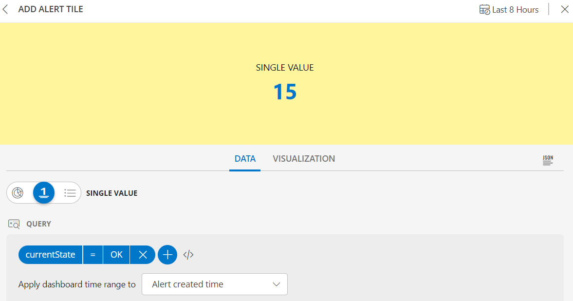
SINGLE VALUE dashboard view for Alert Tile
The following is the SINGLE VALUE dashboard view:
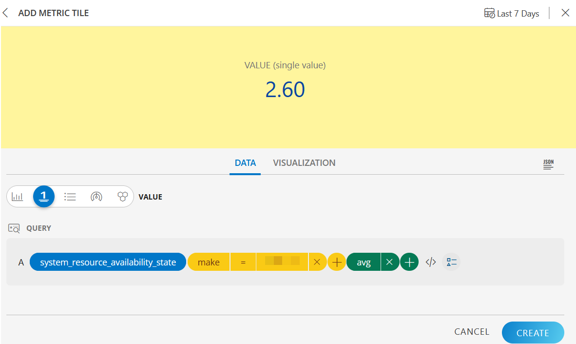
SINGLE VALUE visualization for Metric Tile
The following is the VALUE (single value) visualization with the inputs:
- Metric =
system_resource_availability_state - Filter =
make of the resource - Operations =
avg
SINGLE VALUE dashboard view
The following is the VALUE (single value) dashboard view: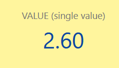
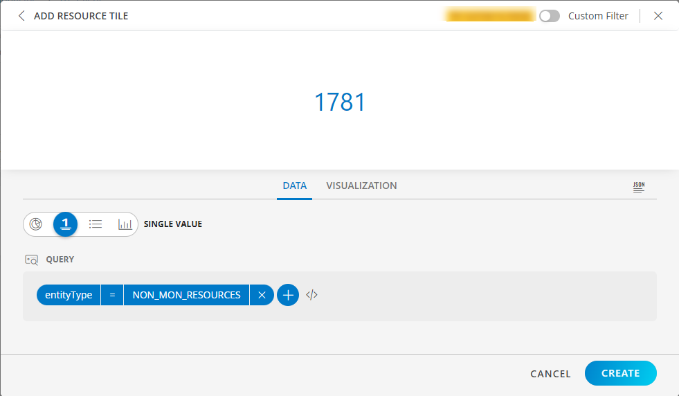
SINGLE VALUE visualization for Resource Tile
The following is the SINGLE VALUE visualization with the inputs:
- Attribute -
entityType = NON_MON_RESOURCE
SINGLE VALUE dashboard view
The following is the SINGLE VALUE dashboard view:
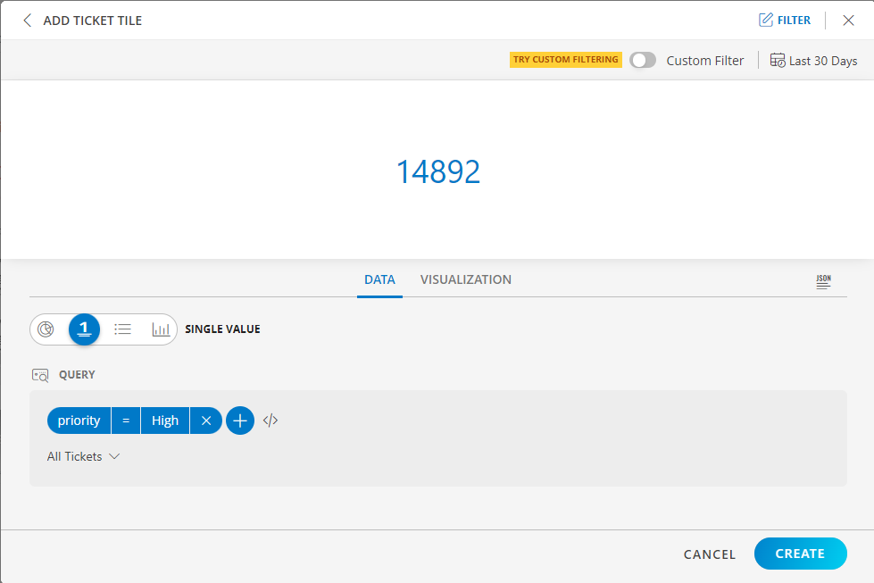
SINGLE VALUE visualization for Ticket Tile
The following is the SINGLE VALUE visualization with the inputs:
- Attribute -
priority = High - Dashboard time range =
All Tickets
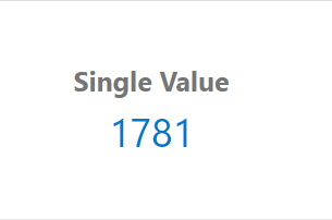
SINGLE VALUE dashboard view
The following is the SINGLE VALUE dashboard view: